Printing On Clay
Lydia Johnson will share a basic overview her
innovative ceramic design process in this streamable online tutorial.
innovative ceramic design process in this streamable online tutorial.
About
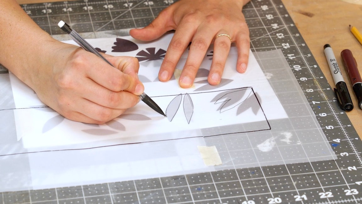
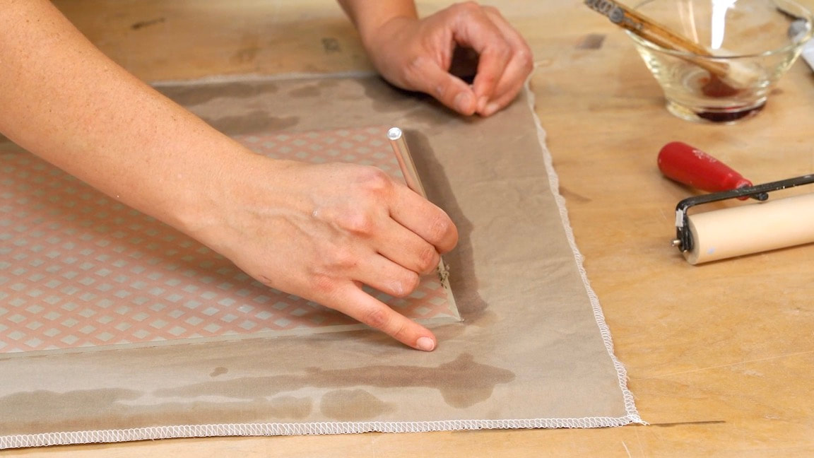
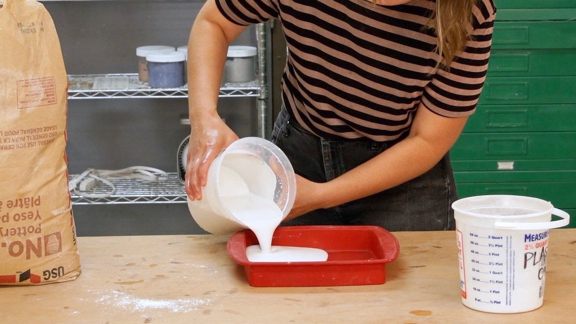
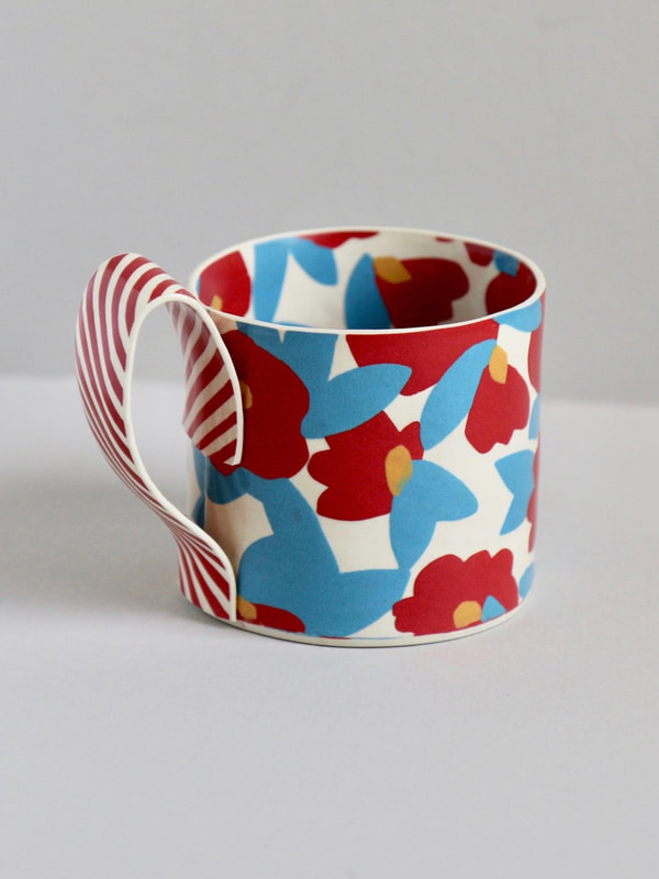
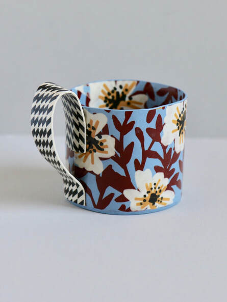
In 2017, I developed a printing technique using stencils and liquid colored clay to create double-sided patterned slabs. This technique is not Nerikomi or Neriage.
I started this particular body of work about 5 years ago. This printing process came about as a result of an unrealized vision I had for a mug. I envisioned a piece of double-sided, printed, colorful fabric, lifting up off of the table and transforming into a cup. It was thin and delicate, with pattern on every single plane of the piece, including the base and underside fo the handle.
At the time, I was not a hand builder. I was exclusively a wheel thrower. I watched Youtube, read books and made a lot of bad hand built things for a while.
I tried using thin sheets of clay as appliqué. I dabbled with nerikomi and neriage. I experimented paper clay for several months. It took me about two years of learning, failing, experimenting & adapting before I finally achieved the cup with aesthetic I sought.
I vividly remember the first time I unloaded a kiln with 10 successful cups. It was an incredible rush. I knew that this was a huge turning point for my life and my work.
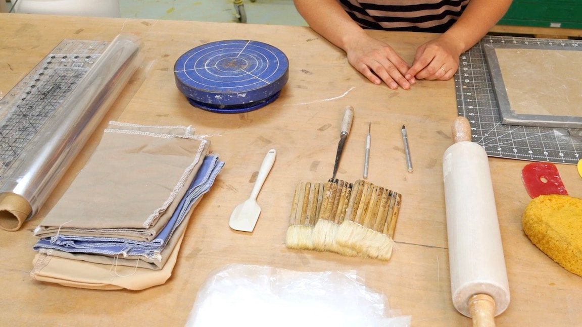
The actual printing process is simple. Though it was not simple to get there.
I started this particular body of work about 5 years ago. This printing process came about as a result of an unrealized vision I had for a mug. I envisioned a piece of double-sided, printed, colorful fabric, lifting up off of the table and transforming into a cup. It was thin and delicate, with pattern on every single plane of the piece, including the base and underside fo the handle.
At the time, I was not a hand builder. I was exclusively a wheel thrower. I watched Youtube, read books and made a lot of bad hand built things for a while.
I tried using thin sheets of clay as appliqué. I dabbled with nerikomi and neriage. I experimented paper clay for several months. It took me about two years of learning, failing, experimenting & adapting before I finally achieved the cup with aesthetic I sought.
I vividly remember the first time I unloaded a kiln with 10 successful cups. It was an incredible rush. I knew that this was a huge turning point for my life and my work.
The actual printing process is simple. Though it was not simple to get there.
|
|
Artistic Point of view
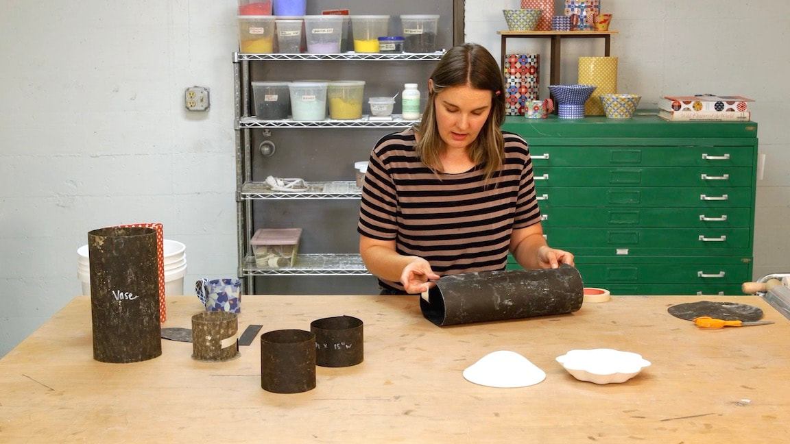
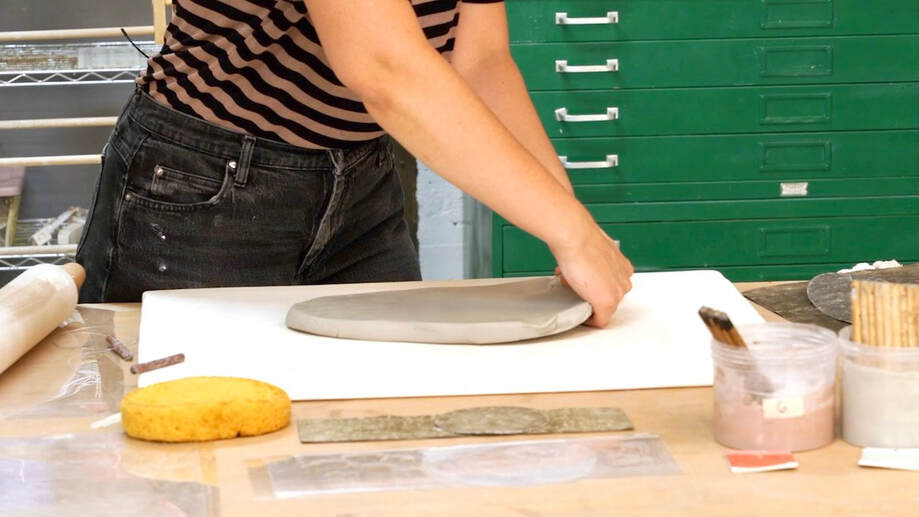
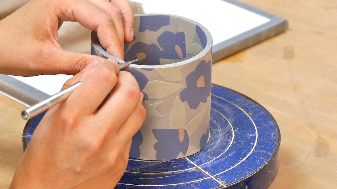
My functional pots are made out of double-sided, patterned slabs. I print imagery on a flat piece of clay and then build with it. In my work, visual pattern and color function as fundamental structure. A double sided, printed slab is my material.
I use tableware as a vehicle to explore imagery within functional forms. These familiar objects challenge me to innovate. How can I evoke feelings or emotions out of something so common? All over pattern/color creates an engaging physical and visual relationship between user and object which I hope orchestrates synergy of the eyes, hands, mind and heart.
When fired, thin slab-built ceramic work reads more like metal or glass. The pieces feel and sound different. They are a little sharp and a little uncomfortable.
I have always loved visual pattern and color, especially in textiles and home decor. I embrace the “mix and match” aesthetic commonly found in quilting, fashion design and interior decoration. My inspiration comes from broad and diverse sources and subjects, but a few specific are: Japanese Kimonos, Indian Chintz fabric, high fashion runway outfits, American folk quilts, Islamic tile work, William Morris.
I’ve admired Kaffe Fasset’s work since I was a young girl. I used to sit and pour through his books, completely enamored with the way he fearlessly mixed colorful wallpapers, quilts, upholstered furniture, rugs, decorative objects and pillows. He creates spaces unlike anything I have ever seen before. They are imaginative and romantic. They are over-the-top, strange, feminine and unapologetic. Nothing matches and its perfect.